
具體描述
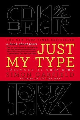
A delightfully inquisitive tour that explores the rich history and the subtle powers of fonts.
Fonts surround us every day, on street signs and buildings, on movie posters and books, and on just about every product that we buy. But where do fonts come from and why do we need so many? Who is behind the businesslike subtlety of Times New Roman, the cool detachment of Arial, or the maddening lightness of Comic Sans (and the movement to ban it)? Simon Garfield embarks on a mission to answer these questions and more, and reveal what may be the very best and worst fonts in the world.
Typefaces are now 560 years old, but we barely knew their names until about twenty years ago, when the pull-down font menus on our first computers made us all the gods of type. Beginning in the early days of Gutenberg and ending with the most adventurous digital fonts, Garfield unravels our age old obsession with the way our words look. Just My Type investigates a range of modern mysteries, including how Helvetica took over the world, what inspires the seemingly ubiquitous use of Trajan on bad movie posters, and what makes a font look presidential, male or female, American, British, German, or Jewish. From the typeface of Beatlemania to the graphic vision of the Obama campaign, fonts can signal a musical revolution or the rise of an American president. This book is a must-read for the design conscious that will forever change the way you look at the printed word.
著者簡介
Simon Garfield is the author of twelve acclaimed books of nonfiction. He lives in London and St. Ives, Cornwall, and currently has a so ft spot for Requiem Fine Roman and HT Gelateria.
Chip Kidd is associate art director for Alfred A. Knopf, where his jacket designs have revolutionized the art of American book packaging. He is the author of numerous books, including The Cheese Monkeys.
圖書目錄
讀後感
本书就是讲述西文的字体发展历程,其实就是相当于我们中文字的字体历史,从甲骨文到什么颜体,柳体之类的。 西文的字数只有26,根据不同国家,可能有不同的变形,但也就几十个字而已。相比中文以万计数的汉字(常用汉字7000个),西文字体创造起来真是太轻松了,只需要确定26个...
評分是通过《字谈字畅》认识的这本书和译者的,虽然之前也听闻过字节社和TIB(Type is Beautiful),但是对于字体的认识停留在衬线和非衬线和各个字体名字还有声名在外的Helvetica等几个西文字体。我想这可能也和中文的语境有关,但是无知并不能怪环境。 就像我们小时候最开始学一...
評分在《机械复制时代的艺术作品》中,本雅明提到,早在文字能够印刷之前,木刻技术已经实现了对版画等艺术作品的复制,而后石印术和摄影术又分别二度改变了文献和形象复制领域的面貌。里头最著名的一个论述是,当现代工业技术可以轻而易举地进行制模、影印、刷版等流程操作之后,...
評分什么是最好喝的饮料呢?1、确实好喝 2、不会腻。那我觉得最好喝的饮料绝对是无色无味的白开水,你永远不会有吃腻的时候,你也不讨厌它。而相比其他各种味道的饮料,一开始的沉迷不会带给你永远的喜爱——万事万物,只有那些低调,平淡的事物是最最长久的。 字体也不例外,本书...
評分p287 尾注20,“杨`范`克林彭” 条目的最后几个字落到了288页上。 P302 图片注释, “Cords):” 无右括弧。或者不需要左括弧; 该页上有一个注释符号①标注在“雷`曼和工厂录音室”之后,但没有找到注释文字; 同段落中的尾注符号[6]没有标注在正确位置上。 p318 注释④:“...
用戶評價
讀完就覺得我不懂字體。“外行因為不懂,所以隻區分得齣brush script與arial那種巨大區彆。其實字體的設計精髓在於nuances,就像葡萄酒。”
评分第一本讀的很開心的曆史書。All glory to the Baskerville Q.
评分第一本讀的很開心的曆史書。All glory to the Baskerville Q.
评分讀完就覺得我不懂字體。“外行因為不懂,所以隻區分得齣brush script與arial那種巨大區彆。其實字體的設計精髓在於nuances,就像葡萄酒。”
评分讀完就覺得我不懂字體。“外行因為不懂,所以隻區分得齣brush script與arial那種巨大區彆。其實字體的設計精髓在於nuances,就像葡萄酒。”
相關圖書


本站所有內容均為互聯網搜索引擎提供的公開搜索信息,本站不存儲任何數據與內容,任何內容與數據均與本站無關,如有需要請聯繫相關搜索引擎包括但不限於百度,google,bing,sogou 等
© 2025 book.quotespace.org All Rights Reserved. 小美書屋 版权所有